The Three Stages of Composition: A Stack, Not a Checklist
Leading lines, symmetry, the rule of thirds — you know the list. So why do the photos still fall flat? Because composition isn't a checklist. It's three stages, and they only work bottom-up.
The rule of thirds is older than photography. It was named in 1797, by an engraver called John Thomas Smith, writing about how to arrange a landscape painting.
And it didn't mean what you think it means. Smith wasn't talking about gridlines, or about where to put a face. He was talking about the proportion of masses — two-thirds water to one-third land — building on Joshua Reynolds' writing about balancing dark against light. What he actually recommended was "the ratio of about two thirds to one third, or of one to two, a much better and more harmonizing proportion."
It has been handed down ever since — through art schools, camera manuals, and eventually every beginner's photography video on the internet — until it arrived in your head as one item on a long flat list, in a form its own author wouldn't recognise.
Leading lines. Symmetry. Fill the frame. Rule of thirds. Look for patterns. Frame within a frame.
Here's the problem with that list: it has no order. Every item sits at the same level, so you work through it like a shopping list, ticking things off. Leading lines? Got some. Symmetry? Sort of. Rule of thirds? Subject's on a third.
And the photo is still dead.
Not because the advice is wrong — it isn't — but because a list can't tell you what to do first. Composition isn't a set of parallel options. It's a stack, three levels deep, and each level only works if the one beneath it is holding.
The three stages
Bottom to top:
- Focal element — who is this photograph about?
- Structure — how does the eye get there?
- Balance — does the finished frame sit still?
The order isn't a suggestion, it's a dependency. Structure is the route the eye takes to your subject; without a subject there's no destination, and the route leads nowhere. Balance is the distribution of weight across the frame; without elements arranged deliberately there's no weight to distribute.
You can't balance a photograph that has no structure. You can't structure a photograph that has no protagonist.
Most failed compositions are a level-one failure wearing level-two clothes.
Stage one: find the protagonist
Every photograph needs someone to be about. Not necessarily a person — a tree, a bridge, a shape, a gap. But one thing that the frame is unambiguously in service of.
Three ways to establish it:
Control the negative space. The space around your subject isn't leftovers, it's the thing making your subject legible — uninterrupted, not empty. Part two is entirely about this one, so I'll leave it there.
Isolate by contrast or depth. Contrast is the fastest tool you have. Tonal contrast — bright thing, dark surround. Colour contrast — one hue that nothing else in the frame repeats. Depth contrast — a sharp subject against a background thrown out of focus. Any of the three will nominate a protagonist in a fraction of a second, before the viewer has consciously decided anything.
Look for three elements. Three is the smallest number that reads as a group rather than a pair. Two things in a frame invite comparison — the eye ping-pongs between them, weighing one against the other. Three things form a shape, and a shape can be taken in whole. It's why odd numbers keep turning up in composition advice, and it's the most useful of the numerical rules, because unlike the rule of thirds it describes something your visual system actually does.
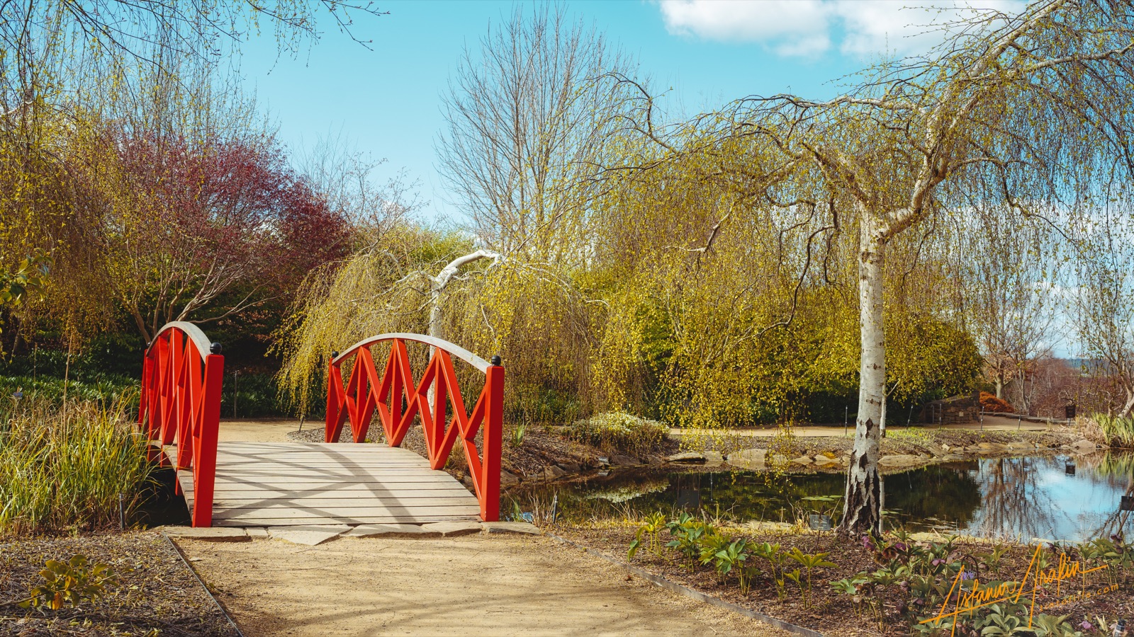
Look at how little that photograph is actually simplified. There's clutter everywhere: branches at the top, foliage across the whole middle band, a path, a pond, a second tree with a bright white trunk competing hard. It works anyway, because the red has no rival. Isolation isn't the same as emptiness — you're not removing things, you're making sure one thing is unmatched in at least one dimension.
Why you can't skip it
Here's what a level-one failure looks like.

Everything in that frame is structurally competent. There's a leading line — the surf traces a long curve from bottom-left to the far headland. There's depth: foreground shrubs, midground water, distant hills. There's a horizon sitting sensibly high. If you ran it against the checklist it would tick most of the boxes.
But ask what is this a photograph of and the honest answer is "the view." The town is too far away to be a subject and too detailed to be a texture. The surf is a line, not a destination. The foreground is a foreground. The eye enters, travels the curve, arrives at the headland, finds nothing waiting, and leaves.
This is the single most common way photographs fail, and it is almost never diagnosed correctly. The instinct is to blame the structure and go looking for a better angle, a stronger line, a tidier horizon. But the structure is fine. You cannot fix a level-one problem with a level-two solution.
The fix is to find a protagonist or find another photograph.
Stage two: build the route
Once something is worth arriving at, structure decides how the eye gets there. Six tools, and they're all doing the same job — moving attention through the frame in an order you chose.
Negative space — the gap that says this one.
Frame — an arch, a doorway, overhanging branches. A border inside the border, which says: everything that matters is in here.
Leading lines — a road, a fence, a shoreline, a handrail. The eye follows continuity almost helplessly.
Pattern — repetition sets an expectation, which makes the break in it a subject. A pattern with no break is wallpaper.
Depth — foreground, midground, background. Distinct layers turn a flat rectangle into a space you can imagine standing in.
Symmetry — the most stable arrangement there is, and the most easily wasted. Symmetry with nothing at the centre is a diagram.
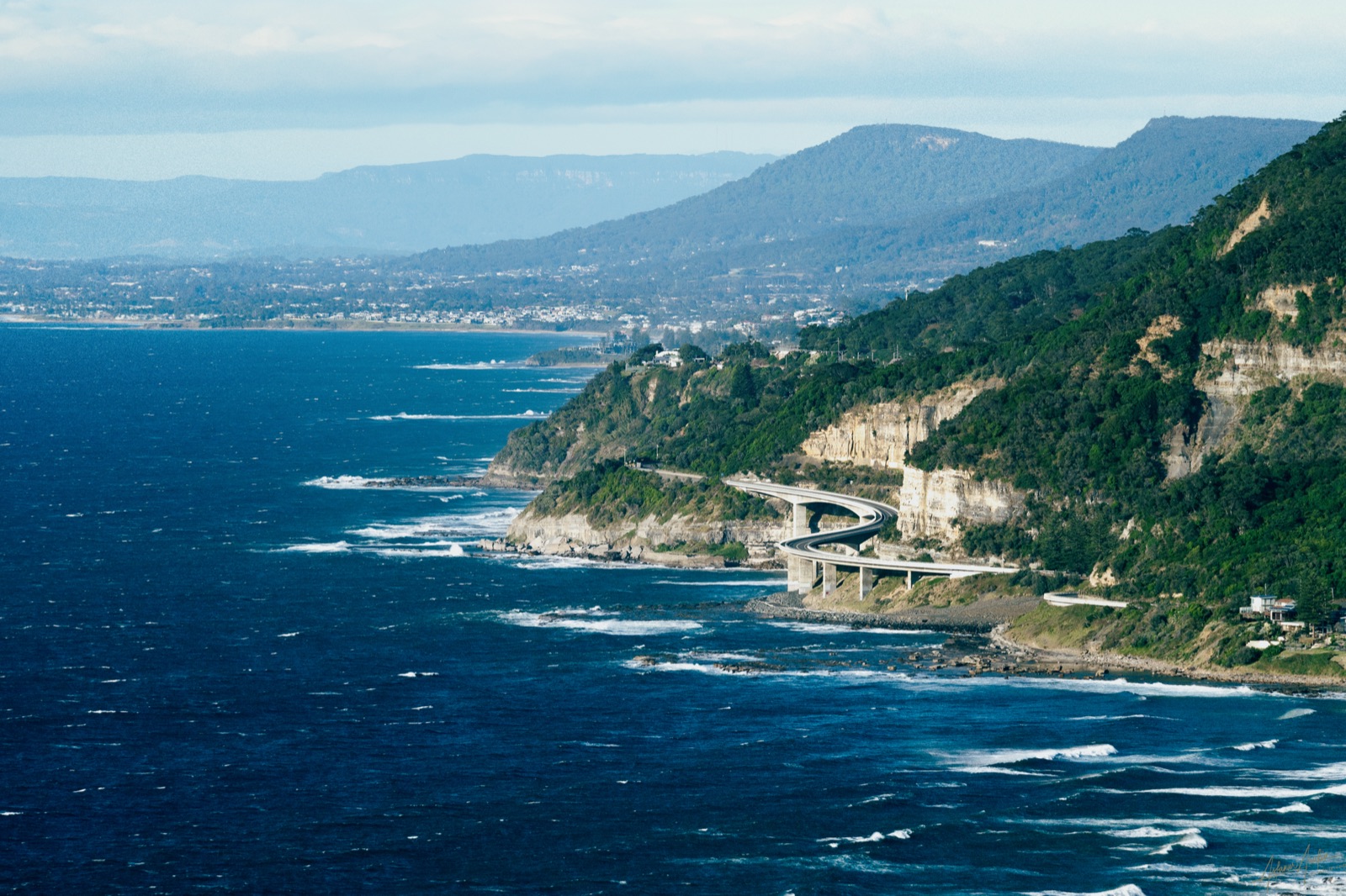
Two things worth stealing from that frame.
The bridge doesn't just point — it curves. A straight line moves the eye fast and dumps it off the edge. A curve holds it inside the frame longer, and gives you control over the pace. When you have the choice, take the curve.
And the depth isn't built from objects, it's built from atmosphere. Each headland is a little paler and lower in contrast than the one in front. That's haze doing the work, and it's the most reliable depth cue there is, because it's the one your eye has been calibrated on since childhood. Shoot toward layered distance on a slightly hazy day and you get depth for free; shoot the same scene in perfectly clear air and everything flattens into one plane.
Stage three: make it sit still
Balance is the last stage, and the hardest to teach, because it isn't a technique — it's a judgement about visual weight.
Every element in a frame has weight. Weight comes from size, but also from darkness, from saturation, from detail, from human interest, and from how close to the edge it sits. A small, intensely saturated thing can outweigh a large dull one. A face outweighs almost anything.
Balance is what happens when those weights don't tip the frame over.
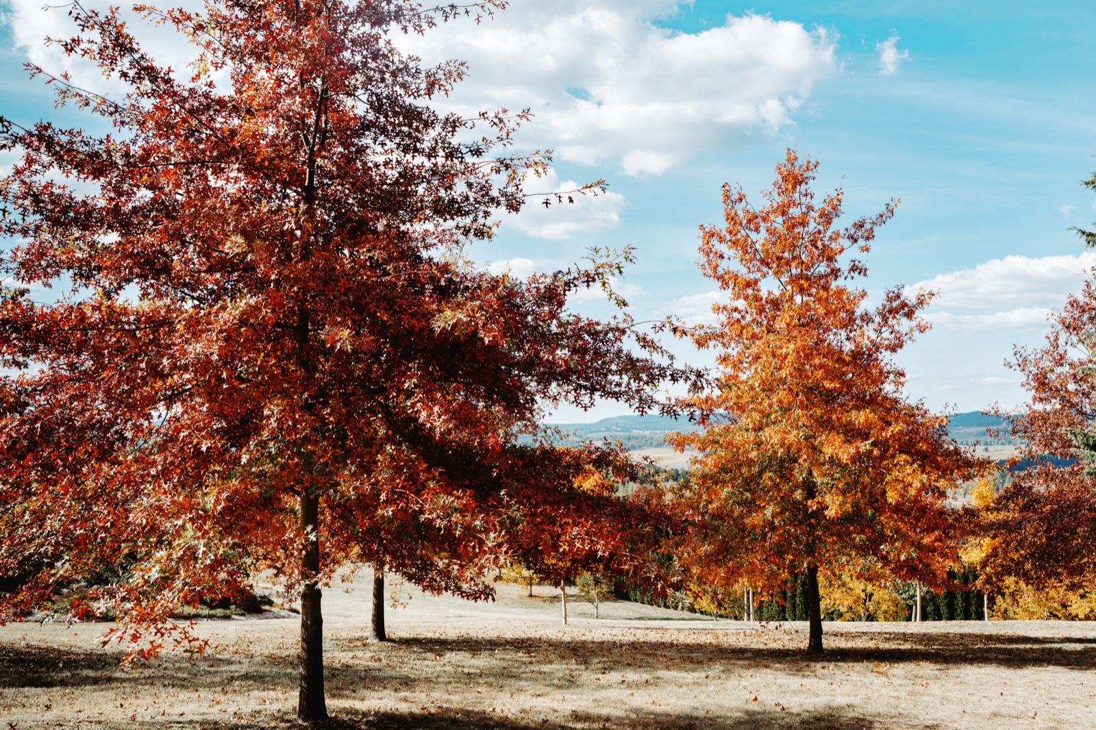
That's the thing people miss about balance: it is almost never symmetry. Two identical trees, evenly placed, would be inert. What makes that frame sit still is that two different weights happen to cancel — a big soft dark mass on one side, a smaller, brighter, more isolated one on the other. It's a see-saw, and brightness, isolation and distance from the centre all count alongside sheer mass.
Which gives you the practical move. When a photo feels like it's sliding out of the frame, you have two options, and reaching for the second one first is a very common mistake:
- Give the light thing more leverage — recompose so it sits further toward its edge.
- Add weight — find something else to put on that side.
Option one is usually a step to the left. Option two usually means clutter.
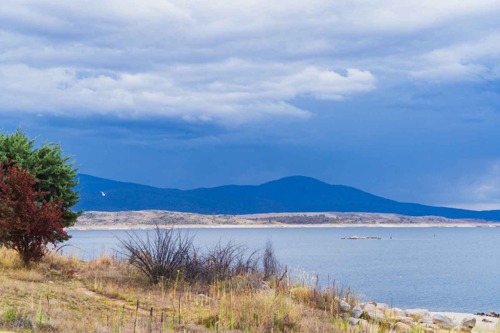
Find the bird — a white fleck just off the tree's edge, against the dark of the ridge. Small enough to miss on the first pass and impossible to ignore afterwards, because it's the brightest isolated thing in a frame of muted blue and the only thing moving. That's weight built almost entirely from contrast and interest rather than size. It isn't what balances the tree — the ridge and the bright shoreline do that — but it's what stops the left half of the frame reading as one dead mass.
Using the stack in the field
Three questions, in this order, before the shutter:
- What is this about? If you can't answer in a word or two, don't take it. This one question kills most bad photographs before they exist.
- How does the eye get there? Pick a tool. One is usually enough — a line, a frame, a gap.
- Does it sit still? Look at the whole rectangle, not the subject. Check the corners.
And the more valuable use, honestly, is backwards. When a photo isn't working and you can't say why, walk up the stack and find the lowest broken level. Is there a protagonist? If no, stop — that's the problem, and no amount of cropping will fix it. If yes, is there a route to it? If no, that's the problem. Only if both hold is it a balance issue, and balance issues are usually a step to the left.
Most photographers diagnose from the top down, which is why so much time gets spent adjusting crops on pictures that were never about anything.
The list isn't wrong
Nothing here retires the rule of thirds. Smith's advice was decent advice in 1797 and it's decent advice now — a subject on a third is a subject that isn't dead-centre, and that's usually an improvement.
But look at what survived the journey. We kept the number and lost the idea. Smith was describing how much of the frame each thing gets, which is a question about weight; the version we inherited is a rule about where, which is a smaller question wearing the same name.
Either way it's a level-three tool. It's about how weight sits in the rectangle — the last thing you should be thinking about, and the first thing everyone teaches.
Learn the stack and the list stops being a list. It becomes three questions with an order, and the order is the whole point: find the protagonist, build the route, then make it sit still.
Part 1 of Building Blocks, a series on the pieces every photograph is made from. Next: Negative Space.