Negative Space: The Half of the Photo You Don't Point At
The most famous shadow in street photography was added in the darkroom. Here's what that teaches us about empty space — and how to use it to make cleaner, calmer photographs.
In 1954, Fan Ho asked his cousin to stand against a wall in Hong Kong. He made a photograph called Approaching Shadow — a girl in profile, with a huge diagonal of darkness sweeping across the wall toward her. It's one of the most admired photographs ever made there. A print sold for HK$375,000 in 2015.
The shadow wasn't real.
Ho added it later, in the darkroom, because he wanted the picture to say that her youth would fade. The emptiest part of the frame — the part with nothing in it — is the part he had to build.
That's the whole idea of this essay. We tend to treat empty space as leftovers: the subject is what you point at, and the rest is whatever happened to be behind it. Ho's shadow says the opposite. Empty space is a material. You choose it. You shape it. Sometimes you make it from scratch.
Why this one gets its own essay
Part one laid out the stack — focal element, then structure, then balance — and if you were reading closely, negative space turned up in it twice. Once at the bottom, as a way of nominating a protagonist. Once in the middle, as one of the six structural tools.
That wasn't sloppiness in the model. Negative space is the only item on that list that does two jobs. It's how you say this one — and it's also how you control the route the eye takes to get there. Every other tool works at exactly one level; this one works at two, which is why the stack can't quite hold it, and why it's the piece worth unpacking on its own.
So: what it is, why your eye needs it, and four ways to actually get it.
Two halves of every frame
Every photo has two parts, and it helps to name them.
- Positive space is your subject — the protagonist, in part one's terms.
- Negative space is everything around it.
Negative space is what gives the subject room to breathe. It isn't the leftover — it's the thing doing the work of making your subject legible.
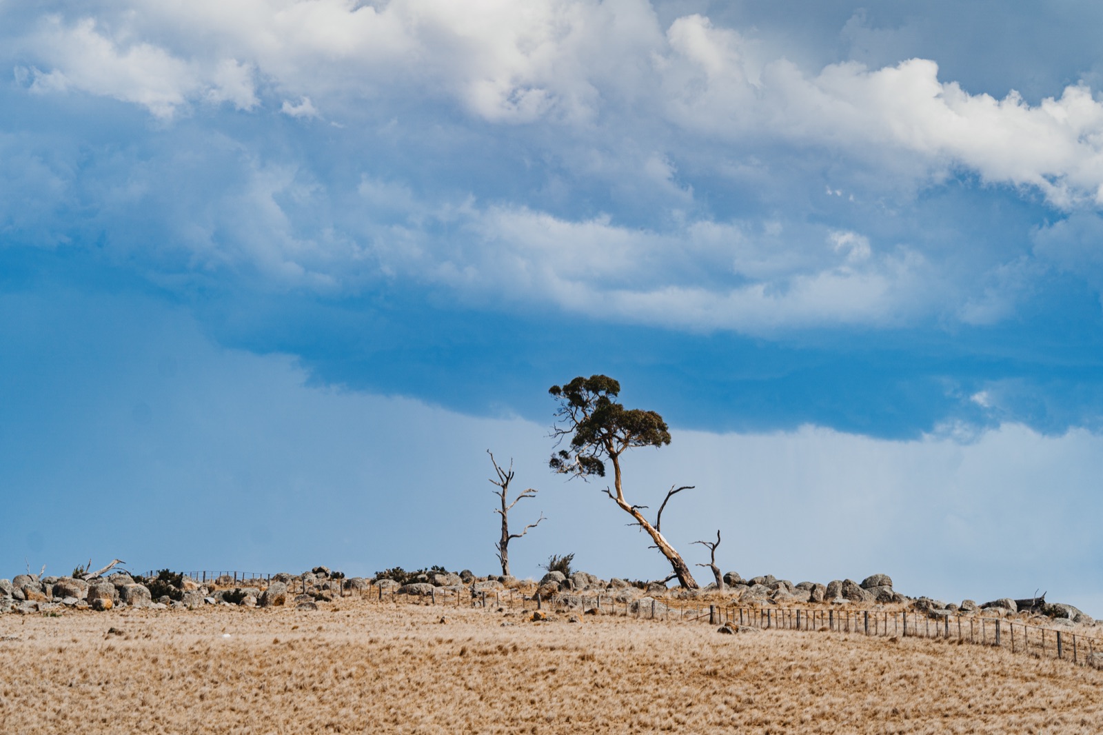
Notice what the sky is doing. It isn't blank, it isn't grey, it isn't out of focus — there's cloud and texture across the whole of it. But none of that competes with the tree. That's all negative space has to be: uninterrupted, not empty. Once you stop equating the two, you start finding negative space in places you'd written off as too busy — a flat wall, a field of grass, an evenly lit road.
Why your eye needs it
This isn't taste, it's mechanical: your eye can't take in a whole scene at once, so your brain splits every frame into figure (the thing) and ground (the surface it sits on) — and it can only hold one of them at a time.
Give a subject a clean gap and that choice is instant; fill the frame with competing stuff and the viewer has to keep making it, which is precisely what we mean when we call a photo "busy."
So every photograph has an order of importance — first this, then that, then the rest — and your job isn't to make the frame empty, it's to make that order obvious.
Negative space is how you do it: the more room a subject has, the fewer places the eye can wander off to, and the faster it lands where you meant it to.
Which makes the useful question not "is there enough empty space?" but "do I know where to look first?" — which is part one's opening question, what is this about, asked from the other side of the frame.
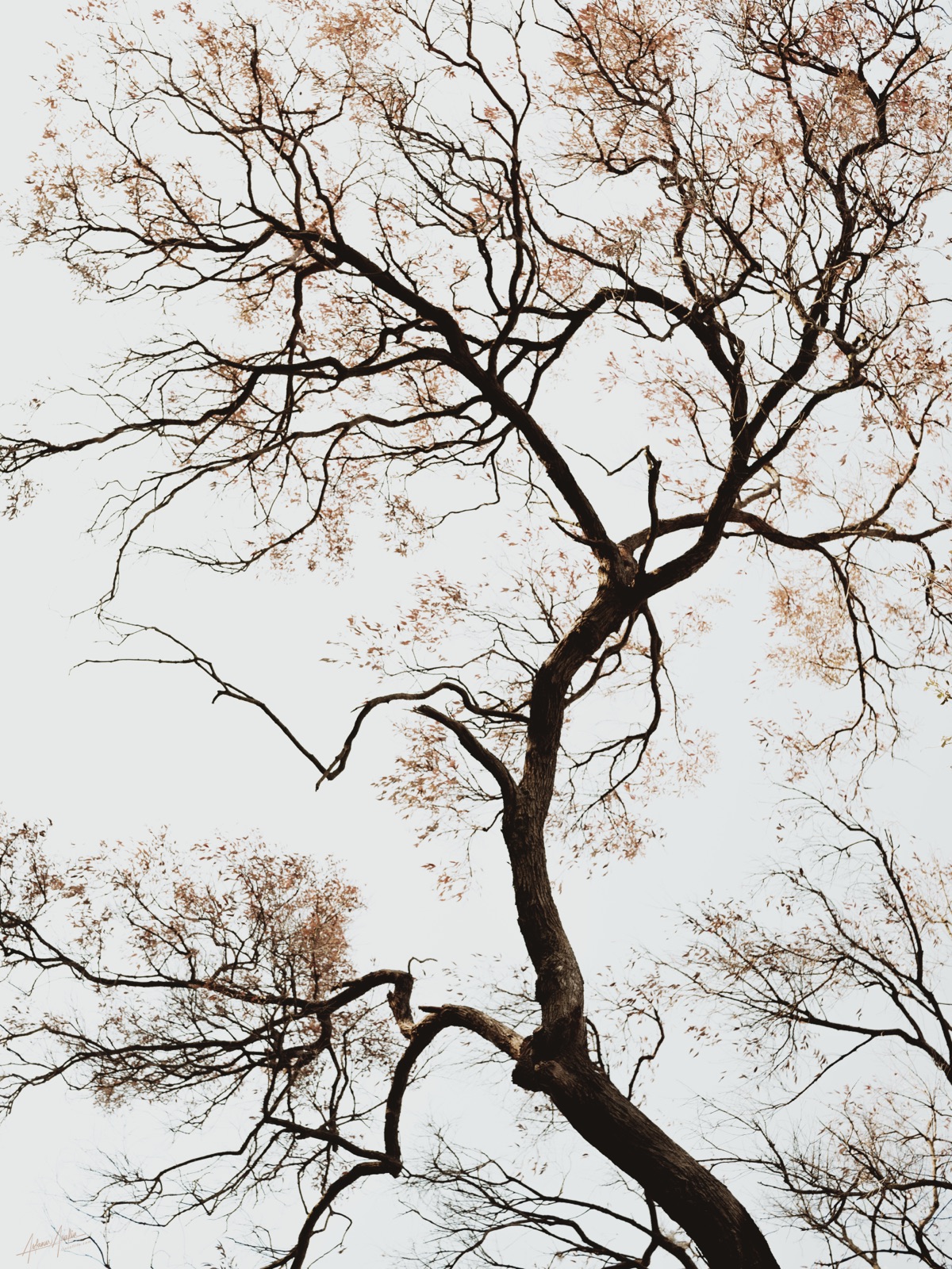
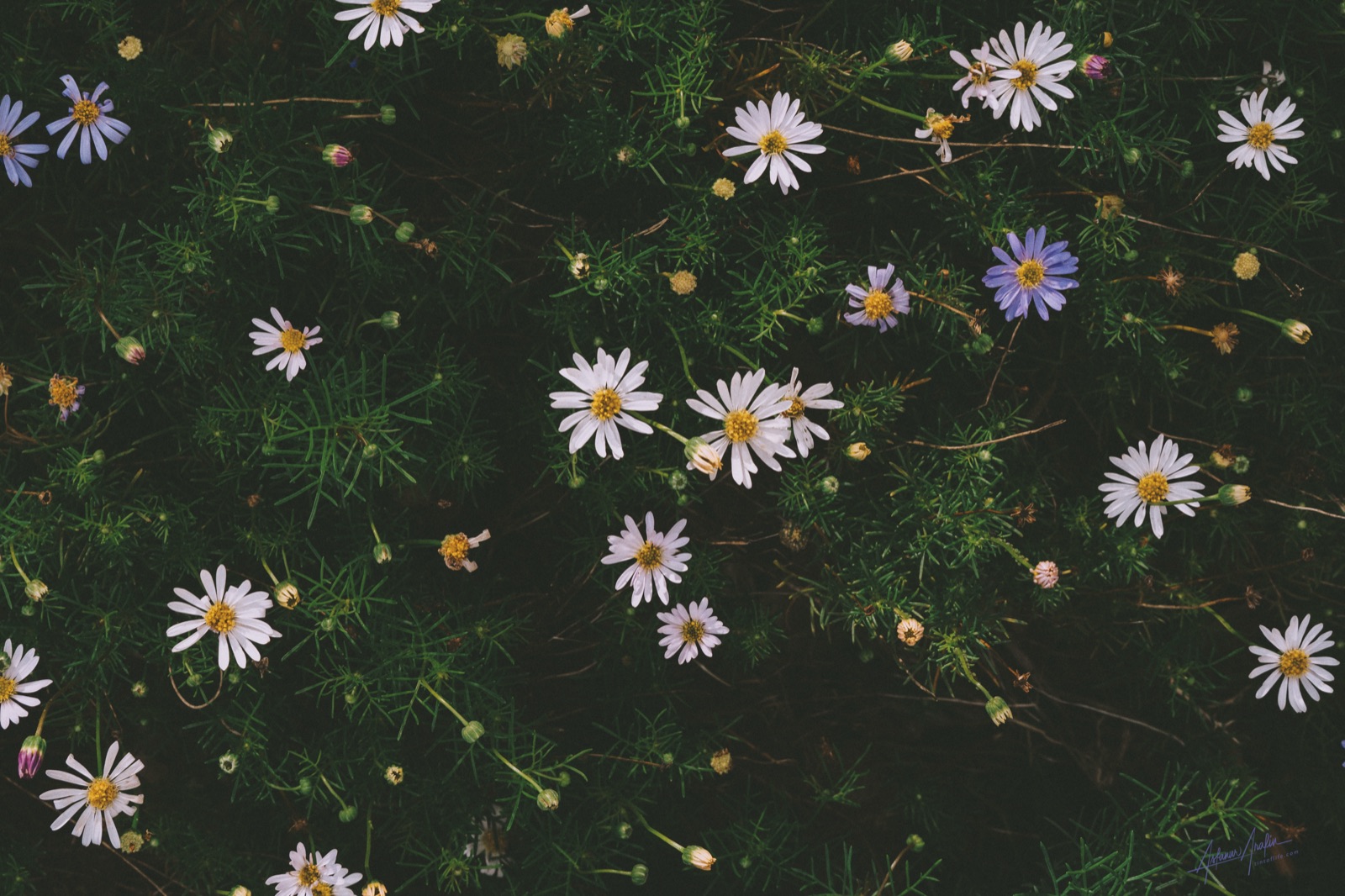
Ma: the Japanese word for this
Japanese has a better word for empty space than English does: ma (間).
The character is a gate (門) with the sun (日) shining through it. An older version used the moon instead — a door with moonlight coming through the crack. The meaning is built into the picture: not a void, but an opening, with something coming through it.
Ma shows up everywhere in Japanese art:
- In flower arranging, the space around the flowers matters as much as the flowers.
- In music, it's the silence between notes that gives them shape.
- In ink painting there's a related idea — yohaku no bi, "the beauty of blank space." Those big untouched areas of paper aren't unfinished. They're what makes the brushstrokes feel alive.
Here's the part most photographers miss: ma is not minimalism. Minimalism is a style — take things away until little is left. Ma is a relationship: the empty part is in conversation with the thing.
Which gives you a better test than "minimalism" ever will. Don't ask how much you can strip out. Ask whether each thing left in the frame is worth what it costs you to keep it.
Four ways to actually get it
Negative space doesn't have to be nothing. It can be sky, water, fog, sand, a wall, a shadow, a blurred hedge. It only has to be low impact: even in tone, no detail interesting enough to steal a look.
Four ways to get it:
1. Open up the aperture. A wide aperture doesn't remove a messy background — it demotes it. Leaves and traffic melt into a field of tone. The mess is still there. It just stops competing.
2. Use a longer lens. Underrated. A telephoto's narrow view is a subtraction tool. A 35mm sees the whole mess; an 85mm or 135mm lets you pick one clean patch of it and fill the frame with that.
3. Move your feet. Often the space already exists and you're standing in the wrong spot. Crouch, and the sky becomes your background. Climb, and it's water, or sand, or road.
4. Wait for weather. Fog, rain, snow, overcast and dusk delete backgrounds for free.
That last one is Michael Kenna's entire practice. He shoots at dawn and dusk, in mist and snow, and gets those still, quiet frames where a jetty floats in a field of nothing. He isn't finding empty places. He's shooting at the hours when the world empties out.
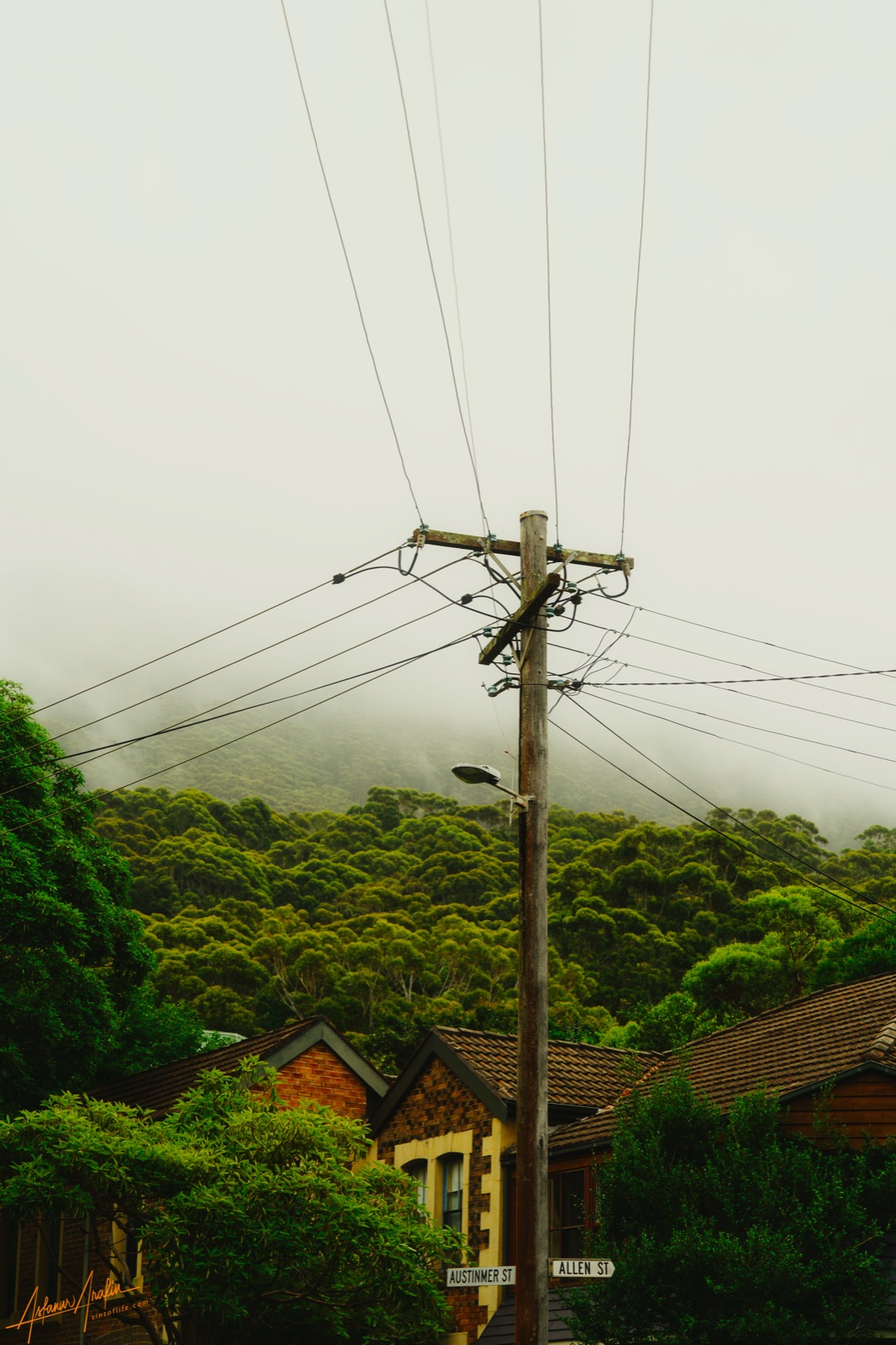
And there's Ho's method: expose for the bright part, let the shadows fall to black, and the darkness becomes your space. Light is the cheapest negative space there is.
How much? Wrong question
You'll read that negative space should fill 50% of the frame, or 60%, or two-thirds. These are fine as training wheels and useless as rules.
Direction matters more than amount.
Put space in front of someone walking, and it reads as possibility — room to move into. Put the exact same amount of space behind them, and it reads as something they've left. Same subject, same emptiness, opposite meaning.
No percentage will ever tell you that. The real test is simply: is the space doing something? Is it pressing in, like Ho's shadow? Giving room? Isolating? Or is it just... unoccupied?
Four ways it goes wrong
Something creeping in at the edge. This is the most common mistake by a mile. A wire, a branch, a stranger's shoulder, the corner of a building. A half-visible shape is magnetic — your brain wants to complete it — so your clean field suddenly has a rival. Check your edges last, every time, before you press the button.
Subject too small. There's a point where the subject stops reading as "intentional" and starts reading as a speck of dust. No formula for where that line is. The test: once the eye arrives, is there something there worth the trip?
Dead space, not quiet space. A big flat area with no life in it isn't calm, it's dead. Skies want a gradient. Water wants some movement. There's a difference between silence and absence.
Emptiness as an excuse. This one's worth saying plainly. Minimalism photographs well by default — a small subject in a big empty field looks competent almost automatically. That makes it very easy to produce pictures that are accomplished and say nothing. Kenna's frames feel meditative because he stood in the cold and knew what he was waiting for. A copy is just empty. The style isn't the meaning.
Which is what Ho understood at that wall: he didn't find his shadow, he decided it — and you don't find negative space either, you decide it.
Part 2 of Building Blocks, a series on the pieces every photograph is made from. Part 1: The Three Stages of Composition.